Ceiling within a ceiling. The office and the workroom while contained with their own ceiling are accompanied by a ceiling that allows for some light into the space.

The forum of the 3rd floor displays a view of the spaces below and consists of an office and a workshop.

When travelling up the stairs to visit the 3rd floor, the balcony below and the curved glass wall on the 3rd floor work in tandem to create a vastness in the space. Once again the glass wall is curved to ease the eye on a 180 degree turn.

Exterior view of balcony facing King Street.

Once a 180 degree turn has been made a balcony facing King Street confronts the viewer. The entrance to the balcony is split into two; one using the ceiling of the 2nd floor and the other using the ceiling of the 3rd floor.

Travelling up the stairs of the building, there is a curved wall with a window welcoming the audience. The wall is curved so as to guide the eye in the direction it need to go, i.e. 180 degrees to the initial direction up the stairs.

Sculpture courtyard merges with interior of the ground floor.

Exterior of building with outdoor courtyard.


 Ceiling within a ceiling. The office and the workroom while contained with their own ceiling are accompanied by a ceiling that allows for some light into the space.
 The forum of the 3rd floor displays a view of the spaces below and consists of an office and a workshop.
 When travelling up the stairs to visit the 3rd floor, the balcony below and the curved glass wall on the 3rd floor work in tandem to create a vastness in the space. Once again the glass wall is curved to ease the eye on a 180 degree turn.
 Exterior view of balcony facing King Street.
 Once a 180 degree turn has been made a balcony facing King Street confronts the viewer. The entrance to the balcony is split into two; one using the ceiling of the 2nd floor and the other using the ceiling of the 3rd floor.
 Travelling up the stairs of the building, there is a curved wall with a window welcoming the audience. The wall is curved so as to guide the eye in the direction it need to go, i.e. 180 degrees to the initial direction up the stairs.
 Sculpture courtyard merges with interior of the ground floor.
 Exterior of building with outdoor courtyard.
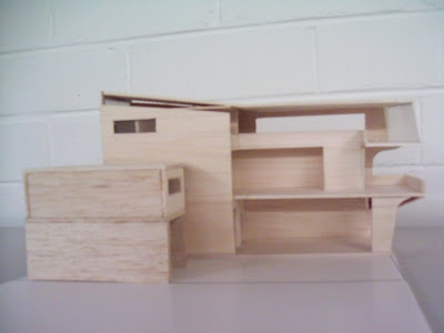
 Basic configuration. Having a main axial entrance and a rear entrance for the storage through the street parallel to King Street.
 A balcony facing King Street is important as it embraces Newtown as the essential setting for the gallery and the art featured in it.
 Basic form. Initially I had an idea that the sculpture courtyard should be situated at the top of the gallery. That way the post office (a similar height as the roof of the gallery) would come into view among the many sculptures and so the sculptures and the gallery would be thought of as being a part of Newtown.
 The Front of the gallery should be iconic and should spark interest. Should give the idea that by entering the gallery, the audience is entering a new threshold, a new world.
 Above: Views from Site 2 upon the expanse of Enmore Road. I chose Site 2 because of its accessibility and its commanding commercial position.
 Views of the amazing expanse of Enmore Road upon splitting from King Street.
 Site 3:
 Site 2:
 Site 1: